Why your Software needs Guidance despite Great UI and UX

Ever been to New York city?
Vibrant place, great food, magnificent people.
Moving around? Not the greatest experience ever…especially if you need to drive or take a cab.
Like most of the North American towns, New York’s map is a grid. Every block’s an intersection.
But, during the day, each intersection automatically translates into a red traffic light.

It takes ages to move ahead a few blocks. Hence, biking is much faster than driving (if streets are not covered in slush!)
But I don’t want to complain about the traffic here… I just took NYC as an example of self-explanatory urban layout. Let me show you how this relates to your SaaS solution and to your UX Design and customer journey.
Table of Contents
Clear and Intuitive Layout
Say you’re driving on 5th Ave. You pass 80th St, then 79th, 78th….If your destination is 68th street you don’t need to be a rocket scientist to know that you just have to keep driving south until you finally hit 68th.
Grid layouts are self-explanatory. Once you’re on the Avenue that goes in the right direction, you just need to wait for the right intersection.

Simply Awesome, right?
Navigation Problems
Three problems, though.
First. What if your destination is 67th St instead of 68th?
If you drive south on 5th Ave you’ll cross 67th but it’s a one way street and you won’t be able to enter. Say you need to meet a friend at 67th and Lexington and you’re currently on 5th Ave, you still need to take 68th Street and then drive south on Lexington.
Second Problem. The whole thing works as long as you can keep driving south on the same Avenue. Say, you’re parked on Broadway near Times Square and need to drive north to meet a friend at Beacon Theater (also on Broadway.) After crossing 59th Street you can only drive south on Broadway. And if you want to drive north, taking 7th Avenue won’t help you either. You need to take 8th Avenue (or 10th) and then switch to Broadway.
Third Problem. The whole trick with numbered streets works in many towns, but if you’re in Manhattan, you can only count on that for as long as you’re in Harlem or Midtown.

Once you cross Bleecker, streets just have names as in European towns. And that’s because downtown Manhattan still uses the old nomenclature. You can’t predict what street comes after Prince St.
In the light of these problems, how can you navigate NYC without guidance despite its clear layout? How would you know where and when to turn to go from A to B?
Oh…and we didn’t even discuss construction sites and detours!
SaaS, UI and Navigation
What I’m trying to say is that streets in western towns are clearly marked. You should always know where you are.
The real problem is not the lack of clarity in the street signs. The real problem is how to go from one place to another without a map or guidance.
Street signs in New York are an example of good UI. They’re easy to spot and clearly labeled.
If you’re in Munich, for example, things might be harder as street signs still use old Gothic characters and names can be pretty long and basically unpronounceable. If you’re a foreigner you’ll have a hard time reading them.

But let’s say you got used to the beautiful, albeit impractical, shape of the letters and you can read street signs even though you’re driving 50 km/h…you are aware that you’re on Hinterbärenbadstrasse and you know that your destination is Ebereschenstrasse. What’s missing?
Even if you can name every street you either need an overview (a map) or you need turn-by-turn guidance to get there. Well…unless you just want to drive around for a long while and hope to miraculously land at your destination.
The same holds true for software.
UI, UX, and Guidance in SaaS
After dealing with several applications, you get used to the language developed by UI designers.
You sign up for a brand new piece of software and, most of the times, you immediately understand menus and icons.
A well-designed interface is precious, but knowing what each button and menu does is only half of the story.

Let me give you a practical example. You might be familiar with Hubspot. The main interface is clear, and you’re familiar with reports, right?
But now, you need to create automation that requires you to sync specific Salesforce triggers with certain Mailchimp and Outreach contact segments….go!
For some of you, this might seem a cakewalk because you’ve already done it.
But the first time you try to create complex automations you might get stuck.
Again…the problem is NOT the interface. The main problems are:
1. Knowing if this is feasible
2. Knowing how to achieve that
3. Not getting lost and accomplishing the task in the most efficient way.
Solutions to Onboarding and Navigation Problems
We hired a hubspot specialist. But companies can’t do that for every piece of software they implement!
SaaS providers try to solve the problem in different ways.
One way is having a support center. You can help your customers on the phone, chat, or via remote support during onboarding and at later stages.
Needless to say, this solution is expensive and time-consuming for both, the client and you.
Another solution is adding documentation: videos or text documents that explain every single process in detail.
Well, for you this means producing lots of literature and updating it every time you change your UI.
For the user, using external documentation means leaving the application, collecting information, going back to work, checking again, going back to the interface…

This solution is like driving in New York City and parking every few blocks to check the map and get back on the road.
Not only is this solution utterly inconvenient. Especially during the onboarding phase, once a user leaves the platform to look for information, odds are that they’ll never come back and start looking for alternative solutions instead.
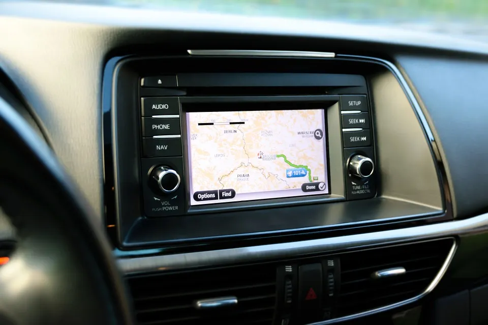
Cars are equipped with navigation systems. This represents the best solution to all the problems connected to cities and mobility.
Therefore, it’s obvious that software should come with built-in guides that show users what to do and at what point while they accomplish tasks.
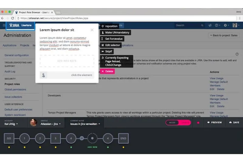
The best way to onboard users and guarantee for a frictionless user experience and the most efficient way to guide users through all the features of a piece of software is having built-in walkthroughs.

When onboarding users, these on-screen guides can be used to present all the main advantages of the application while allowing users to set up the environment and start working with the solution.
Afterwards, these walkthroughs can also be used to steer people in real-time within the application, so that they can accomplish tasks while being guided without any external support.
All modern cars have a navigation system embedded and guide drivers in real time. At the same time, modern software now comes with built-in walkthroughs that guide users while they work with it.
If you’re in New York and need to meet a friend, your GPS will guide you through the streets of Manhattan while you just need to concentrate on driving. In the same way, on-screen walkthroughs guide software users through processes in real time so that they can concentrate on the results.
How to Integrate Guidance in your SaaS Application
Coding built-in guides is a very taxing activity. Plus, every time something changes in the application, your developers will need to adjust or modify all the related walkthroughs.
But the whole thing can be a lot easier.
Check out our editor: it allows everybody to create on-screen guides for SaaS applications without coding.

You developers can concentrate on core activities (your product) while you or anybody else in your team can create guides on top of your software to onboard and guide users in real time.
Userlane is a high-end solution to solve all the problems connected to onboarding and supporting users within an application.
Learn more about employee training and support

