Why UI is a Failed Attempt to Solve Complexity

Our road network is full of great design features: lane markings, street signs, roads to follow, intersections and many more. They are very simple and easy to understand, even in a foreign country.
People don’t need that much time to become familiar with the traffic language and memorize the meanings of signs and markings. Our road network’s user interface, so to say, is great.
Yet, we still rely heavily on our car or phone’s navigation system to guide us through it. Why then, if this road network is so easy to understand, do we still rely on guidance to get from point A to B?
Our road network shows us the name of the streets or the direction to take at each intersection. They show us where the next turn will bring us: turn right and you’ll reach Madison Lane.
As users, we don’t care about the next street in a series of directions. All we want is to arrive at our destination; the options in between are only steps between here and there.
Table of Contents
The Advantages connected to Guidance
This is why we love our navigation systems so much! We don’t need to learn every route by heart. We simply put in the beginning and end points and voilà, we are now masters of the road with knowledge dispensed at our fingertips!
Whether we are exploring a new city or driving through an uncharted country, our navigation system leads us to our desired destination safely. What a great user experience!
What we call a ‘userlane’ is such a guided experience for software. A user is taken by the hand and shown how to seamlessly achieve his or her goal in the software.
The user interface is the core link in human-machine interaction. The UI creates the basis for a great experience but can only provide a generic structure that incorporates some form of basic orientation.
No matter how simple the interface is, when a user doesn’t (or can’t) bring him or herself to spend the needed time mastering it, they will feel frustrated and hopeless.
This fosters a feeling of resentment and leaves the user to blame the software for increasing, rather than eliminating, the obstacles keeping them from reaching their goals.
A Simple Example of Frustrating UX
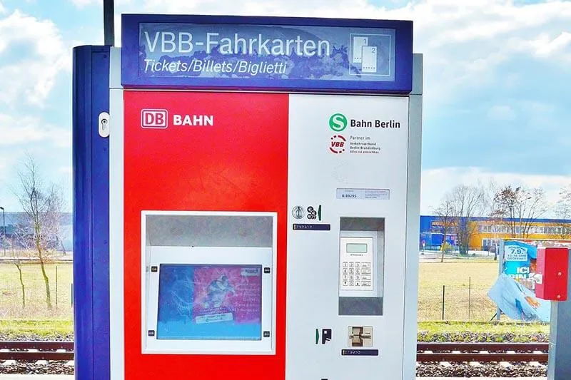
When you buy tickets for public transportation in European cities, the interfaces are simpler than simple: big buttons, descriptions everywhere, and huge characters and icons. They are easy to understand and operate.

Yet, everybody hates the experience because the ticket machines only show users a set of predetermined options they have to choose from. What I want to know as a user is NOT what options are available, what I need to know is which option is the right one for my needs! Which particular ticket do I have to buy for my trip?
People need to make this call under stress and time constraints…public transportation doesn’t wait for anyone. The user interface, despite being clear, doesn’t solve the problems that contribute to such a horrible experience.
Users don’t need to be presented with options, but solutions.
Guiding Users through Processes
Guiding users through a process in a piece of software means making decisions for them that lead to the best outcome in the most reasonable amount of time.
Now, back to our streets. Streets signs are simple and easy to understand. Any intersection will show me my options. But, knowing these options only helps so much. If the direction shown is not my destination, signs aren’t that useful anymore.
For instance, if you drive around Germany, you need to know that to go from Nuremberg to Essen you have to go through Cologne before deciding to follow signs for Cologne.
When I’m on the road, all I want is to know how to get to my destination. The intermediary steps might represent useful clues, but they don’t provide me with what I ultimately wish for: security in the decision making process, and having my ultimate goal always in sight.
Again, the user interface of street signs is fairly simple. It supports the driver with all of the available options, but still doesn’t help them to achieve their goal.
Interfaces can only do so much in terms of guidance. We can try to keep navigation hierarchies low, or reduce the necessary steps to perform an action, but this requires a complete restructuring of the software which is for most projects no longer possible.
Gmail is a good example for this. It would be nearly impossible for Google’s engineers to change the interface of Gmail because of the sheer amount of users they have.
When tasked with addressing a problem within the software, they couldn’t override or rewrite the entire application to solve it. They introduced a completely new interface as a standalone solution: ‘Inbox’. Both interfaces coexist within Google’s platform now. Inbox provides a way better user experience, yet most users still stick to the old Gmail interface. Now, why is that so?
Because users are resistant to change, software can’t be edited as easily as some engineers would wish. It’s natural for us to try and preserve energy and automate everything in our heads.
Resilience to Change
We form habits and get comfortable with the automated processes we encounter everyday. If these habits are broken, maybe a site is under construction or an update pauses the entire process, the unfamiliarity causes stress and anxiety to build up deep within us.

Ever had a splinter in your foot? Your body adapts rapidly to this disruption and develops a new walking style, becoming more present in your life with every single step. This small splinter has now become a severe annoyance, obstructing your daily routine. We as humans sometimes prefer to maintain our daily habits in order to preserve energy.
In the enterprise software world, where software is not chosen for its sexiness but for the stone cold value they bring for the company, this problem is even worse.
Getting employees to accept a new software is so difficult that companies try to avoid even the smallest changes. This is why Internet Explorer 8 and 9 are still around. Enterprises have built an immune system resistant to change and reliant on outdated software.
Enterprises experience cases in which software is dropped by their employees because they would rather stick to older software rather than learn how to use a newer, sleeker one.
For instance, I vividly remember an occasion in which employees who were requested to adapt to a newer version of MS Excel simply decided not to spend the necessary time learning the new platform even though this would better suit their needs.
Instead of embracing something better, these employees went back to their old Excel version because this required less effort. Let me emphasize this: they went back to a worse tool, just because they already knew how to operate it.
Software solutions have a legacy problem by design, because users don’t want them to ever change. Product managers cannot change the hierarchies or the click paths within their applications, yet they have to help the users achieve their goals.
This can be illustrated, yet again, with our road network. It’s simply not logical or proficient to move cities closer together or restructure roads to make navigation easier for the driver. The design has been made and will remain as such well into the future.
This is why a navigation system is helping not only the user, but also the provider. The person behind the infrastructure can explain a system without having to redesign it.
Enhancing UI and UX with On-Screen Guides to Bypass Complexity
Complexity in software is not connected to the user interface. UI and UX designers have been working for a very long time trying to create a universal language that makes it easy for everybody to interact with a piece of software.
But when you take business software, the actual problem is connected to the sheer amount of options, choices, and processes. Every choice opens the doors to a series of other choices that branch out and create a very complex environment.
Complexity is the enemy of usability and is directly connected to the abundance of features and options which are normally present in common business applications.
The structure is usually easy to understand, and buttons and icons are clearly marked. Despite such a clear interface, without any form of instructions it would be impossible for a newbie to carry out complex operations within the software.

The problem is not knowing where you are or what a specific button does, the problem is how to accomplish tasks within such a complex environment.
Simplifying the structure or the actual interface can’t improve the situation.
Typical solutions that companies adopt to overcome complexity include handbooks, Q&As, community support, live chat, or video tutorials.
Sometimes software companies also implement what we call tooltips which are simple bubbles that present elements in the interface. But, again, the problem with complexity is not connected to the UI, and all the other forms of support are asynchronous and can’t onboard users within the interface itself.
Many software products already have similar tools integrated within their platforms.
However, many of these tools are only patches that don’t actually solve the problem linked to bad UX. Most of these support tools focus on the wrong issue. A glowing dot that shows me where the “new project” button is (as it happens with toopltips and similar solutions) doesn’t help me complete the new project. If the software truly has a good user interface, the user could easily find this option without any frustration or confusion in the first place.
The real issue is not locating a button or a menu, but finding the right sequence of steps to take to successfully complete tasks and go through the entire process.
Onboarding Users Requires Interactive Guidance
Users need to be taken by the hand, and guided in real-time, through the software. The everyday user is easily stressed out by their daily routine and usual common problems they need to cope with and don’t have much time to figure out how to overcome every single issue in a piece of software.
They simply can’t handle another obstacle in their path. This is why you can’t let your software become a hurdle between your users and their goals. You wouldn’t want them to treat your product the way they would treat a European ticket vending machine, right?!
One way to ensure a great user experience is to provide your users a very short list of goals that they can achieve within your software. From there, you can guide them through your system in real time to achieve each single one of them.
Userlane
Userlane allows you to create such a navigation system without changing the underlying software and without any coding knowledge.
You simply click through the process in your software in the editing mode, and userlanes – the name for these walkthroughs- are automatically built in the background.
With Userlane, you can provide users with solutions, not with options.

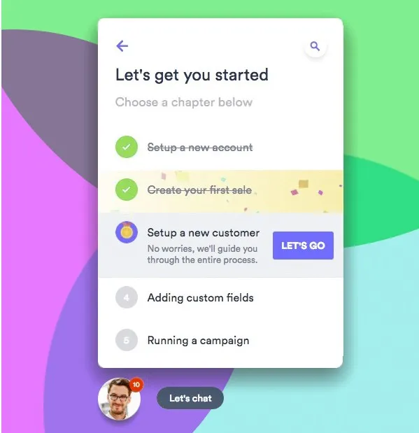
Once a new user opens your application, they’re welcomed by a virtual assistant that can guide them through any process in real time. This virtual assistant can always be recalled on screen so that users can access a list of guides divided into chapters.
Say the user is required to add a new supplier to their database; they can expand their virtual assistant menu, find the corresponding guide and follow simple on-screen instructions that show them where to click next and what information they are required to enter at each step until the process is complete.
This approach makes training redundant and improves the UX by eliminating uncertainty and frustration. That’s why a very large number of SaaS companies implement on-screen guides to create onboard tours for their trial and new users and companies worldwide introduced these walkthroughs to onboard and train staff on their software stack.
If you can’t (or don’t want to) change your software and still need to achieve your goals in terms of churn, retention, engagement or feature adoption, schedule a demo today and try Userlane for free for 30 days.


