
Considering this post is about the user experience (UX) and user interface (UI) terms every product manager should know, let’s start off with a question and definition: What is UXD short for and how can it be defined? I’ll give you 20 seconds to answer …
3, 2, 1 …
Answer: UXD (or UEX or XD) is short for user experience design and can be defined as the branch of design that creates easy-to-use and pleasant/pleasing/delightful (your pick) products that focus on your user’s needs.
I’m sure it goes without saying that UX is one of the most crucial elements to you, as a product manager, because it is one of the key components of the four pillars of product leadership (aha, some more terms for you to know: soft skills, business acumen, domain knowledge, and technical skills).
UX is essentially another trinket in your product management treasure chest, all of which help you to create and deliver the best possible product that solves the pain points of your users and reduces the frustration and doubt associated with many products, particularly SaaS (software-as-a-service) applications.
Table of Contents
Defining Terms Associated with UI and UX: A Little Story
Now, I was simply going to give you a list of UX and UI terms and their accompanying definitions, but I figured that as much as lists are practical and easy-to-read, they’re also quite generic, so I’ve decided to create a little story instead. Hopefully, it’ll give you a quick break from your busy life as a product manager and help you remember all of those sneaky little terms you should know.
And don’t forget to bookmark this post for the latest UI/UX terms! We will continue to maintain and grow the list as the terminology develops.
So without further ado, let our story begin:
Steve is new on the job: It’s his first day as a product manager and his first day at a new company called Snapple Software. He’s pretty nervous, as expected, but he’s been in the software business for a while and he’s already taken quite a few intensive online product management courses over the past year.
In fact, one of the more intensive courses for him was the one where he had to learn 15 terms and definitions associated with UI and UX and then complete a multiple choice quiz. At the time, he only managed to score 8 out of 15, which wasn’t too bad for a first-timer. For the ones he got wrong, he made a study sheet of them, and he’s now stuck them to the wall of his new office. This is what his study sheet looks like:
VOC (voice of the customer)
It is a market research technique that is used to give a detailed set of a customer’s wants and needs, which are then organized into a hierarchical structure in order to prioritize them. It also refers to the customer’s voice in terms of expectations, preferences, and comments. It is a customer’s feedback on their experiences with and expectations of your company.
User Onboarding
Onboarding a user means creating a welcoming and enjoyable experience for new users by easing them into learning how to use your product/ application. A good or bad onboarding experience can make or break your business – important note!
What is Design Thinking?
DT is an iterative process where those involved in the product team seek to understand the user as much as possible, challenge assumptions, and redefine problems. This is done to help identify alternative strategies and solutions. DT also gives a solution-based approach to solving problems. It helps with empathy and gaining insight into what the target user wants and needs and involves constant experimentation, such as sketching, prototyping, testing, and trying out concepts.
Mockup
As the name suggests, a mockup is a model or a design replica of a product. It is necessary for gathering user feedback early on in the product life cycle and is typically created prior to prototype or feature testing. Mockups are static, unlike prototypes, which are dynamic.
What is a prototype?
Fun fact: Prototype is a Latin word meaning ‘primitive form’, so it’s essentially an early sample or model built to test a concept, idea, or process. Each prototype serves a purpose and helps the product team make the next decisions. Prototypes can also be seen as simulations of designs that are meant to put the testers in the proper mindset to answer questions through behavior. Prototypes generate actionable data and give product managers a framework for evaluation and benchmarking new product features.
Wait a Minute: What’s the Difference Between Wireframes, Mockups, Prototypes?
Come to think of it, Steve is still a bit confused between mockup and prototype. So he asks one of his team members, Jeff, to clarify things a little more. This is what Jeff tells Steve:
Jeff: ‘Steve, apart from mockups and prototypes, you also need to consider wireframes. Now, it can get a little bit confusing, so pay attention. Wireframes, mockups, and prototypes simply represent the different stages of the design flow.
A wireframe is the very basic and visual representation of the design, and it doesn’t need to focus too much on the finer and smaller details. However, it must express design ideas and shouldn’t leave out/ skip important parts. Once again, it’s static and shouldn’t contain too many details/ content.
Your prototype should look very similar to the finished product, and you must use it to test the product and get critical feedback from your users. Finally, your mockup is kind of like a static design diagram that must show information frames and statically give content and functions. In comparison to the wireframe, a mockup resembles the prototype/ finished product, but more importantly, it is NOT interactive and NOT clickable – it’s basically just a graphic representation. Your prototype is the one that is dynamic, clickable, and interactive. Basically, your idea for your product will go from wireframe to mockup to prototype to finished/final version.’
Now because Steve’s learning style is more visual than aural, he asks Jeff to give him some images representing the differences between wireframe, mockup, and prototype. This is what Jeff gives him:
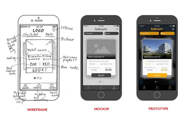
Now that Steve has a more thorough understanding of these three terms, he notices that there’s a graph Jeff gave him that contains the word ‘fidelity’. So he decides to do a bit of research and discovers that low fidelity just means having very few features, such as a wireframe that is often simply created with plain sketches, where a mockup, for example, is high fidelity because it is ‘pixel perfect’ and presents all the content and functions of the product.
UI and UX Differences (and More)
Jeff could see that Steve was a little unsure of himself, especially with this information overload regarding concepts and definitions. So he decides to give Steve a quick task: 1) List the differences between UI and UX, 2) differentiate between a moderated user test and an unmoderated user test, and 3) give the definitions of responsive web design and information architecture.
Thankful for the task, Steve goes back to his new office to put his knowledge to the test: (Quick test before Steve gives his answers: How would you differentiate between these concepts? Let’s see if your definitions are similar to the ones Steve provides).
Define User Experience (UX)
- How a user feels when interacting with a product (negative or positive experience?).
- It encompasses all aspects of the end-user’s interaction with the company, its services, and its products.
- It requires the frictionless merging of several departments (like engineering, marketing, and different forms of design).
- UX designers must study and assess how users feel by evaluating aspects such as ease of use, perception of value of the product, utility, and efficiency in performing tasks.
- It evolved from improvements made to the UI over the years.
What is User Interface (UI)?
- The UI is the series of screens, pages, and visual elements (like buttons, icons, keyboards, sounds, lights) that allow a user to interact with a product/ service.
- It is anything a user may interact with when using a product.
- It forms part of the user experience (a complicated or impractical UI will make the end user frustrated with the product, meaning that the user will have a negative perception of it, and this will contribute to their overall experience with the product and the company).
Meaning of Moderated User Test
- A session with live interaction between the test team and test users.
- Used to gather qualitative data by answering test users’ questions and replying to their feedback – all in real time.
- Used to get a more in-depth view of the user’s experience with the product.
Define Unmoderated User Test
- This is a user test with no live interaction between the test team and the test user – i.e. the user can do the test whenever he/she wants to.
- Used to gather quantitative results via video clips of the user’s screen/ audio recording of the user’s voice etc.
What is Responsive Web Design (RWD)?
- RWD is what provides an optimal viewing experience across all platforms and devices, meaning that the content and layout of a website should always adapt/fit to the sizes and technical abilities of the device it’s opened on.
Explain Information Architecture (IA)
- IA is the organization of information, such as web content and labelling schemes, and makes it easy for people to find, understand, and manage information.
Upon completion of his task, Steve goes back to Jeff and shows him his answers. Jeff takes a quick read-through and is super impressed by and satisfied with Steve’s answers. Finally, Steve is starting to feel a little more confident about things on his first day.
Teaching The Interns About UI and UX Concepts
However, Jeff wants to shake things up a little more. There’s a team of interns at the company and Jeff wants Steve to teach them a thing or two on important concepts they’ll also need to know if they want to participate in future meetings and conversations with different people in the company. Steve thinks this is a great idea because teaching helps him learn, too.
Steve sends out a quick survey to the interns, asking them what they’d like to learn about. Turns out they’re also interested in learning about UX and UI concepts (what a coincidence!). Steve sets his presentation for Friday and begins planning his lesson.
To make the introduction to so many new terms and concepts a little easier, Steve decides to focus only on seven of them – he’ll do the rest in another lesson.
He decides to gamify the lesson and make it more interactive and fun – after all, he wants to motivate the interns to learn and apply their knowledge beyond the walls of the classroom. He decides to give each intern a definition to learn and then give an example of how it would work in real life:
Intern 1, Elon: What is the definition of a user flow?
This is the path taken by a user in an application in order to successfully complete a task. The user flow takes the user from an entry point through a set of steps towards either a successful outcome or a final action (such as buying a product or completing a tour).
Example: The user goes to Tesla’s homepage to a category page called ‘electric cars’. From here, the user clicks on a car of their choice (a red Roadster). From there, they click on icons that allow them to add specs. They can then click ‘request a test drive’, submit their details, and then leave the website.
Intern 2, Bill: What is a variant/ design concept?
This is a different version of a product or a design, and it is used to evaluate what version will receive the best response from users. Variants are basically products that differ in some aspects from each other but are based on the same model.
Example: To use Elon’s example, a product design variant could include the colour of the Roadster. Would a white roadster receiver a better response from the customer or not?
Intern 3, Julie: What are Gestalt Principles?
This is also known as the ‘Law of Simplicity’ and states that every stimulus is perceived in its simplest form. In other words, people don’t just see items in isolation – they see them as part of a whole.
Intern 4, Alicia: What is a backlog?
This is an easy one! It’s just a buildup of work that needs to be completed. No example needed ;).
Intern 5, April: What does the Net Promoter Score (NPS) indicate?
The NPS indicates how likely a user is to recommend a product to a friend. If they recommend it, you know that they find your product pretty valuable!
Example: April to Bill, ‘Wow, Bill, don’t you just love working with Slack here in the office? It’s so easy to use – I hope the next company I work for will use it too. In fact, if they don’t use it, I’m definitely going to suggest they do!’
Intern 6, Gibson: What is an A/B Test?
A/B testing, which can also be called split testing or bucket testing, involves comparing two versions of a webpage or an app against each other in order to determine which version performs better. It involves showing two or more versions of a page to users and statistical analysis is then used to see which version/variation performs better for a desired outcome.
And important to remember: You should only change ONE element at a time. If you change more than one, you’ll never know which one was responsible for the outcome.
Example: Netflix has an advert for the latest films it’s showing. The team decides to test the advert by altering the color of the call-to-action button (red vs white). Half of the traffic will then be shown the original version of the page (red call-to-action button) and the other half will be shown the modified version of the page (white call-to-action button). Data analysis then takes place to see the effect on visitor behavior.
Oh, and a call-to-action or CTA is the word or phrase that causes users to interact with a product in a desired way.
Intern 7, Don: How do you determine the conversion rate?
This is determined by the number of users who achieved a specific goal divided by the total number of visitors. It is often measured by a specific call-to-action, signup form, or another predetermined goal.
Example: Verizon wants you to sign up for their new newsletter. They have a CTA saying ‘sign-up for our newsletter’. They will measure the conversion rate by dividing how many people actually fill in the sign-up form by how many people simply click on the CTA and visit the sign-up page without actually signing up.
Needless to say, Steve was pretty happy with the outcome of his lesson.

UI and UX Learning Continues!
A few weeks later, after he started getting into the swing of things, Jeff tells Steve that he will be attending his first design conference to be held in Silicon Valley. Such a great opportunity, but definitely a little nerve-wracking. So Steve decides to spend some time doing research on this conference, see who’d be attending, and what he can prepare. He realizes quite quickly that there are still a few terms he isn’t 100% sure about, so he decides to expand his vocabulary and knowledge base a little further – and he decides to involve the interns once again.
This time, he gives the interns material to study and then asks them to define the definitions they’d learned:
Steve: Bill, how would you define interaction design?
Bill: Interaction design is the study of how a user interacts with a product or application. It is abbreviated as IXD and mustn’t be confused with UX design or UI.
Steve: Good answer. Now, April, can you explain what the 3-click rule and the 5-second test are?
April: The 3-click rule theorizes that users will leave an application if they are unable to successfully complete what they want to within three mouse clicks. The 5-second test involves showing users a single content page for five seconds to gauge their initial reactions. Oh, and wait! You didn’t mention the F-Pattern, Steve! It’s important for the other interns to know. The F-Pattern refers to how readers read web pages in an F-shaped pattern – two horizontal stripes and the one vertical stripe (focusing on the left-hand side of the page).
Steve: Great job, April. Yes, the F-shaped pattern allows readers to read a webpage very quickly – pretty interesting, right? While on the topic of horizontal and vertical lines, can anyone tell me what a grid is?
Don: It’s basically a system of horizontal and vertical lines that provide the structural basis for page layout and design. It’s important for economy, consistency, order, and flexibility.
Steve: Awesome. And what about the Golden Ratio?
Don: It’s a mathematical ratio found in nature and people believe it’s the most aesthetically-pleasing layout to the human eye. The ratio is about 1,618. Also, I wanted to ask, what is the 60-30-10 rule?
Steve: Good question. It’s a rule to help you put a color scheme together. The 60% + 30% + 10% is used to give balance to the colors used in any space. The basic rule of thumb is to choose a primary color that dominates 60% of the area, a secondary color that takes up about 30% of the area, and an accent colour comprising 10%.
Julie: I actually also came across something called the 80/20 rule. Can anyone explain it to me?
Gibson: Sure. The 80/20 rule states that approximately 80% of the effects come from 20% of the causes. In other words, 80% of a product’s usage involves only 20% of its features or 80% of a company’s revenue comes from 20% of its products. It’s a great rule to use when prioritizing design efforts.
Steve: Now, importantly, can anyone tell me about the minimum viable product?
April: As the name suggests, it’s a product with just enough features to meet the needs of early customers. Importantly, it gives designers and the product team important feedback on how to develop the product further. It’s basically a product that has the minimum amount of features to satisfy an early user.
Don: While we’re on the topic of customers, can you quickly explain what a customer journey map is?
Elon: It’s a visual representation of the process (journey) a customer undertakes in order to achieve a specific goal with your company. It helps you understand what your customers’ motivations are in terms of their needs and pain points. A customer journey map maps out the current process your customer is going through – from the first to the final touchpoint – and helps you see if your customers are reaching their goals or what can be done to help them reach their goals.
Steve: Don, do you know what CX is?
Don: Yes, that’s customer experience, correct? It refers to the interaction between a product and the customer throughout the entire relationship – from the very first moment your customer is attracted to your product right through to purchase and use. And it shouldn’t be confused with UX. I read that CX is a much more recent development – only about 12 years old. And it refers to how customers perceive their interactions with a company.
Steve: Correct! And quick fact: According to research, customers are prepared to pay almost 5 times more for a product or service if the customer experience is good. And what about customer success?
Alicia: The customer success team in a company is responsible for managing the relationship between the customer and the company, so they play a critical role in helping the customer achieve their goals. They want to make the customer as successful (and happy!) as possible, thereby reducing churn and increasing the customer lifetime value (CLTV) of the company. CS is also more of a strategy than it is a department.
Steve: Great. Bill, can you define value prop. and USP?
Bill: Sure. USP stands for unique selling proposition (you can say point, too) and they are the main reasons why a user will choose one product over another. Why would you choose Android over iOS for example?
Steve: Let’s not get into that debate …
Bill: Yes, sorry. Back to the other definition: A value proposition describes the user’s primary reason/motivation for using a product or the main benefit/ advantage they receive from it.
Steve: Okay, good. Alicia, you can give me the last few definitions we need to discuss today. Do you know what a landing page is? And a persona? What about an end user? Or user engagement? Just give me quick definitions.
Alicia: A landing page is a single-page website or the webpage a user is directed to after clicking on a specific link. It is also known as a target page or a destination page. A persona is the creation of a representative user based on data and user interviews. The personal details may or may not be fictional, but the information used to create this user is not. It’s designed to represent a group of users. The end user is simply the person who uses a product/website or those who participate in research studies. And lastly, user engagement refers to the deliberate choices an end user makes within an application.
Steve: All right, good job everyone. Seems like you’re well on your way to becoming product managers yourselves!
Defining UX Writing
A few weeks later, Steve is invited to work with the company’s marketing team and the UX writer on creating microcopy for a few landing pages. He knows that microcopy is the text that appears in bite-size bits all over a webpage or application (such as the text in a label or a step or a CTA or those just-in-time clear instructions), but he actually didn’t realize how much skill is required to create microcopy!
He also has a good conversation with Alexa, the company’s UX writer. She tells Steve that she is responsible for writing copy for the company’s product and webpages and that she needs to conduct extensive research, understand best UX practices, and create user experiences from end-to-end.
Steve already had an idea about UX writing, but seeing as it’s his first time working as a product manager, it was good for him to have a deep, in-depth discussion with Alexa about her profession. She even gave him a quote he should remember when teaching the interns about UX writing:
It’s fair to say that UX writers should be content strategists, but not all content strategists should be UX writers.
UX vs. Usability and UX vs. CX
Having finally settled down in his position after a few months, the interns decide to approach Steve whenever they need to for some help. Don is a little bit confused between UX and usability, so he asks Steve for an explanation:
It’s important to remember that usability is part of the user experience. They are definitely not the same thing. User experience is basically an umbrella term that encompasses all aspects of the user’s experience when he/she interacts with the product, software, service etc.
Usability, therefore, falls under UX and refers to the ease of access and/or use of a product, service, or website.
UX design and usability were once used interchangeably but this is not the case anymore: usability is an important contribution to UX, but it is NOT the whole experience. UX is the WHOLE experience. If it helps, you can ask these questions:
Usability: Can the user accomplish his/ her goal successfully? Is the software, for example, easy to learn and simple enough to use?
UX: Did the user have the best experience possible?
Oh and don’t get confused between UX and UX Design – UX Design is the actual process of creating products that provide meaningful, relevant, and practical experiences to users.
At this point, Alicia tells Steve she had recently attended a conference and was surprised that some experts there were using the terms CX and UX interchangeably. She’s convinced that UX and CX are separate terms that actually shouldn’t be used interchangeably.
Steve tells her that she is correct and that CX and UX do indeed differ. He explains to her in simple terms:
CX looks at the whole experience, including ALL channels of the brand. It represents every step of the journey, such as looking at adverts to comparing prices to trying the product to buying the product and, ultimately, to using customer support, customer service, and customer success. UX is more specific and refers to the end-user’s experience with a specific product, like a SaaS application.
CX is, therefore, greater in scope.
And just when Steve thought he knew just about 100% of all the UX/UI definitions he needed to, Kim, the company’s latest addition to the UX team, introduces Steve to a few more terms. He decides to make one last list for himself to stick on his wall.
Hopefully, that’ll be all he needs … for now at least!
Steve’s Final List of UI/UX Terms
What is card sorting?
A method to help design the information architecture of a site. In a card sorting session, team members organize topics into logical or sensical categories. Cards can be paper-based or online using a card sorting tool.
Clickstream analysis meaning:
The process of gathering and analyzing data about which pages a website visitor visits and in which order they visit them. The path the visitors takes through a website is called a … clickstream.
Explain competitor analysis
Exactly as the name suggests. An evaluation of the strengths and weaknesses of competitors, whether old, current, or future.
What is context of use analysis?
Collecting and analyzing information on intended users, what their tasks are, what tools they need to achieve their goals, technical constraints, and any other factors that will have an influence on the UX.
What is an empathy map?
A collaborative visualization tool that describes what is known about a particular type of user. It is used to gain a deeper, more insightful understanding of your user/ customer.
Explain the entry field
Where users make text or data entries.
What is a Fishbone diagram?
A diagram to help identify cause and effect relationships between factors in a given situation. The head states the problem and the bones along the spine represents the factors. It’s a great visualization tool for trying to identify the root causes of a problem. Pretty neat!
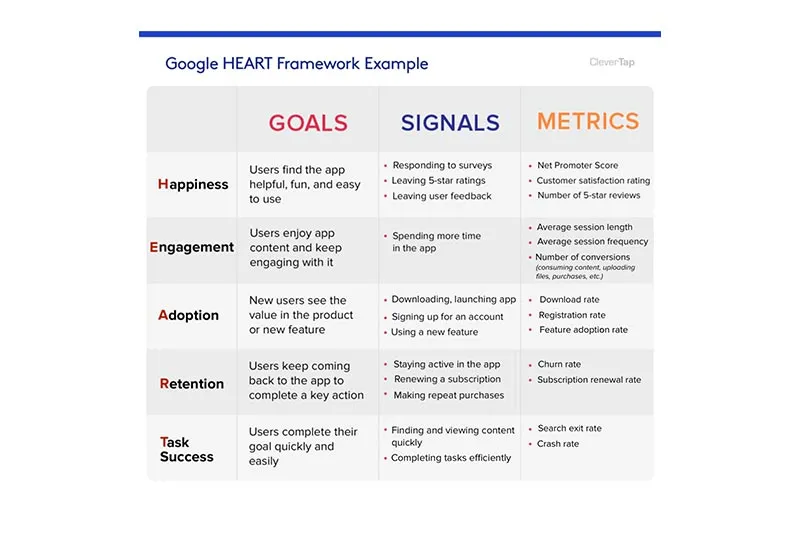
Define Heart framework
A measuring tool to evaluate the user experience on a large scale based on Happiness, Engagement, Adoption, Retention, and Task analysis. HEART!
Explain Hick’s Law
A law that describes the time it takes for a person to make a decision based on the number of possible choices he/ she has. The more choices, the longer it will take to make a decision.
What is learnability?
How easy (or difficult) it is to learn to use a software/ interface etc. effectively.
Meaning of participatory design
A design approach that involves all stakeholders in the design process.
Define Think Aloud
A method used to collect data in usability testing where a user is asked to think out loud about what they see.
Explain user research
Used to focus on understanding a user’s needs, behaviors, and motivations through various research methods.
Adding UI and UX to Your Superhero Kit
If you’ve been reading our blog posts (you have, haven’t you?), you’ll know that we’ve referred to product managers as the superheroes of a company. I also just came across an article describing product management as the ‘everything profession’. Definitely true. You have a number of critical tasks to deal with across different departments and all at the same time.
Now, you’re not required to be a professional in every single thing you do. I.e. you’re not meant to be an expert coder and a professional UX writer and a marketing guru and the world’s best UX designer and a business development manager and and and … . Yes, you are a superhero., but superheroes have their specialities. Spiderman is Spiderman because of his, well, arachnid-type abilities. Superman can fly. The Hulk is just … green and strong. You get what I mean.
Your superpower is being a product manager and that superpower is made of up of you possessing a specific level of knowledge in all areas. That’s why it’s important to know the terms relating to UI and UX I’ve presented in this article. It gives you a deeper understanding of what each person involved in product development does, and it gives you an overview of how each profession and technology come together to create the overall product.
So whether you’re like Steve and new on the job or have been in product management for quite some time now, it’s always important to keep up with the times, the terms, and the evolving technologies. And in the words of Albert Einstein, ‘If you can’t explain it simply, you don’t understand it well enough’, so here’s hoping my little story will help you keep those UI and UX terms fresh in your mind – you never know when you might need them.
Now that you know some of the UI/UX terms, why not find out if your SaaS business is ready to take on the challenge of thriving in the product-led era? Take our quick quiz and see how you fare!