Prevent Customer Churn

Many applications seem incredibly easy at first. Their user interface (UI) is polished and clear. A standard menu with classic icons and maybe a sidebar with common functions which are easy to access follow simple rules that any average user can understand.
The main dashboard of many apps or SaaS solutions is meant to let users work with basic functionalities and seldom looks intimidating. That’s because the number of choices you can make are often limited and the interface implements many familiar elements we are all used to recognizing and dealing with.
Then again, as soon as you try to set up your working environment or perform basic operations, you suddenly feel lost in an ocean of decisions and just give up. Or, other times, you just can’t move on because of the lack of options.
Complexity in software is not connected to the elements in the UI, but to the large array of choices that follow at each step and the path the the user needs to take to complete tasks.
The way SaaS companies present options and help users to deal with choices is often the main reason why new customers don’t sign up after a free trial.

Table of Contents
Doors and Choices in the Customer Journey
Say you enter a house and there are only three doors and these three doors are clearly marked to tell you where they lead to. You can easily decide where to go based on what you think your needs are. Once you pick a door you find yourself in another room with more doors and this time directions seem to be vague.
You still decide to proceed and chose the door that seems to be more familiar based on your past experience in a similar environment.
Once you go through this door, you finally have just one option which is not what you had expected. The only thing you can do now is going back and try a different path.

You might experiment for a while until you realize that:
- You still don’t know what you can actually do in that place
- You don’t know what the actual benefits of being in that house are
- You simply tried to follow your gut instinct based on similar places you’ve visited
- You feel frustrated because the whole experience was based on trial and error
Eventually, you decide to leave and go to a nearby family restaurant to rest and enjoy a soothing meal!
User Experience Design and SaaS Applications
Personally, I use a gazillion and a half software applications. And I’m definitely not the only one! We all need to work with a plethora of fancy tools nowadays.
Just a few days ago, I realized I needed automation to support a series of tasks connected to content promotion. I was spending a lot of time doing things that could actually be done by a simple software solution.
A friend of mine suggested me to try a new service and I immediately started a free trial.
How far did I go with that? I didn’t even complete the initial setup.
I got stuck with a field that would require me to enter information which was not relevant for me at all (not exactly what you see in the picture…but the image should give you an idea of how I felt at that moment!)
I couldn’t leave the field blank, nor proceed or go back. After fiddling with the settings for a while I clicked on “account” and finally on “delete permanently.”
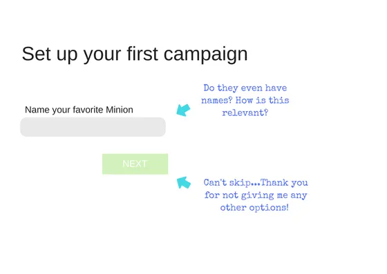 Total time spent in the app: 20 minutes. Accomplishments: zero.
Was the problem connected to the layout of the main dashboard? Not really. There were only two or three options to choose from at the very beginning.
The main problem was that either the software was not actually meant to do what I thought it would, or the option I was looking for was to be found at a later stage I never got to. But I’ll never know.
Complexity can sometimes derive from the lack of options.
What would have made my experience smoother and less frustrating? Probably clear onboarding instructions and some guidance.
User Experience (UX) design is the backbone of every applications that goes from a successful onboarding to a well-defined customer journey.
No matter if you feel overwhelmed with choices or are stuck due to the lack of options, without guidance the whole experience is simply frustrating.
Customer Journey and churn
SaaS products offer many advantages connected to scalability and maintenance. On demand, cloud solutions are attractive for their adaptable pricing models and the fact that software is obviously always up to date.
But because they need to appeal to a wide range of potential customers, these services need to be flexible and customizable while offering different layers of complexity based on the intended use.
Specific user segments will want to utilize the software in a slightly different way, in order to adapt processes to their own business model. And that’s why a rigid “one size fits all” solution seldom makes the cut for larger businesses. Complexity is necessary.
Therefore, the biggest challenges for SaaS businesses are connected to a clear customer journey.
Once a user decides to try out a specific solution, they need to clearly understand the scope of the application, its core advantages, how to perform tasks based on their expectations, and how to customize the environment to match their needs.
Users might feel lost in a house full of doors or find themselves stuck behind a door they can’t open.
At that point, they might try to explore the area for a while, but soon they’ll give up and try another solution.
And this, despite how clear the UI actually is.
When Users Feel Lost
As mentioned, I subscribe to tons of services and applications. Let me give you another example that shows how a company tried to deal with complexity but failed.
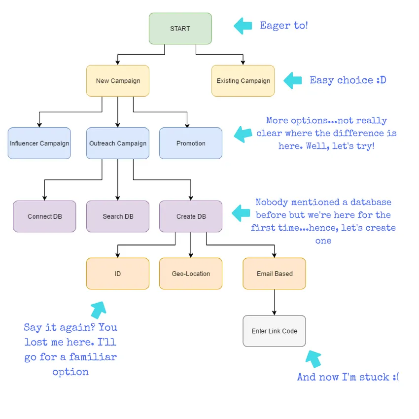
A few weeks ago I went for a new marketing platform. This particular software seemed to be a great solution for a series of challenges we were facing at that moment.
The application presents in fact a very long list of use cases. Not all of those were interesting for us, but I was eager to try it out and test its potential in a few specific areas.
And that’s when it started to be painful…

Setting up the application was easy enough and all the menus and tabs were clearly marked. But then it was time to start the first campaign and so I began to wonder what feature would be useful at that point.
After experimenting for a while, I remembered that, after subscribing for the trial period, I had received a welcome mail with a link that was labeled something like “knowledge base.”
I went back to my inbox and clicked on the link. I landed on a page that only contained a long list of use cases, a sort of table of content. All the cases were clearly labeled and it was relatively easy to find the link that would help me start the campaign.
I clicked on it and was redirected to a page where I could choose to either watch a four-minute video or read an article that would explain what to do.

I decided to go for the article because I thought I could quickly skim through the text and find the answers I was looking for without spending four minutes watching a tutorial.
Then, when things seemed clear I went back to my dashboard and finally started to work on my campaign only to return back two more times to that article because I was stuck at later stages.
The whole experience was, again…frustrating. And not because I felt intimidated by the interface. The problems were connected to my expectations and my biases which derive from my experience with similar applications I used in the past.
Being forced to go back and forth from my inbox to the dashboard, from the TOC to the articles and back to the dashboard simply delayed my interaction with the software and after setting up the first campaign I never returned back.
A Confusing UX Leads to Churn
Once you’ve acquired new SaaS users, the biggest challenge is to reach the wow effect and make sure they keep using your software.
The problem is that you, as a designer, know exactly what your application can be used for but you have a hard time when it comes to conveying the actual benefits of your solution.
All too often customers sign up for a trial and, after a while, they either feel comfortable in the ecosystem you created and see the potential of the application or they cancel their subscription.

How to actually Present Choices and Create a Pleasant User Experience
The aim of a successful UXUI design,in addition to reducing complexity, is to focus on the journey and actively guide the user from point A to B. Sophisticated applications are complicated in terms of processes, choices, and customization but there are a few tricks that can help address the problem:
Progressive Disclosure: Designers should make sure users focus on a single decision at a time. In many cases, a program requires users to input of multiple pieces of data to function correctly.
If all these pieces of data are presented at the page load, this can cause confusion and anxiety. It is essential to draw the attention of the users to one single element at the time and help them move on to the next step.
UI Consistency: Creating a clean layout for users is essential to reduce complexity. For instance, buttons, text, and navigation elements must remain perfectly consistent across screens for the user to navigate the interface with ease.
Consistency of styles builds confidence in consistency of performance of the product and in turn creates a habitual link to the interface, where navigation becomes a no-brainer.

Feature Segmentation: It is important to remember that different users utilize the same program for different purposes and at various levels of proficiency. Some users are more advanced than others and their expectations are higher, sometimes by a long shot.
Customization plays a big role in this case, and you need to place more emphasis on segmenting features by user type, putting the most complex ones behind an ‘Advanced Settings’ option that allows the top tier of users to access the tools they need while keeping normal users from shying away.
Legitimization: Explaining users where they are in the process, where they are going and why a particular step is necessary can make a huge difference. Clearly pinpointing the reasons why users need to fill to fill out specific information or go to a particular section provides a clear picture of the process.
Additionally, this also allows users to understand the product and its functionality. For software owners this also means that they can motivate users by showing them WHY they need to take that path to go from A to B and giving them a preview of what they can expect (reward) once they go through the process.
Contextual Help: This step is the most important, and allows you to guide the user through the entire journey without forcing them to leave your application.
On-screen interactive guides prevent users from getting stuck while explaining and legitimizing each step in real time.
Closing the Knowledge Gap Between Humans and Machines
Our company provides interactive guides that assist each user individually throughout the entire journey and steps in to aid SaaS in facilitating the process of onboarding.
Even if the application presents a solid UIUX design that simplifies interaction, complex programs still require contextual help to get the users onboard and prevent churn.
Userlane allows users to recall guides connected to specific processes within the software solution and complete tasks in real time with the support of a virtual assistant.

This virtual assistant can be used to show where to click next and how to fill out forms in a process. The overlay automatically highlights one single element at the time and blends out the remaining portions of the user interface to focus the attention and make sure that users don’t accidentally click anywhere else.
The guides can also be used to provide the user with more information about a procedures and sell the benefits of a software application.
While attempting to set up the environment or accomplish operations, users are not forced to leave the software to find additional information. Support happens live within the application itself, reducing the risk of people abandoning the platform to never come back.
No matter how complex a process or an SaaS application is, Userlane successfully guides users through all the layers of complexity connected to choices and options.
Guidance happens in real time while users work on the tasks and, for SaaS companies, it becomes extremely easy to onboard users, increase conversion and activation rate, and drastically reduce churn.
Want to know more about our solution?
Learn more about employee training and support