Home  Digital Transformation and Digital Adoption User Onboarding Best Practices (+Examples!) for 2020
Digital Transformation and Digital Adoption
User Onboarding Best Practices (+Examples!) for 2020

Table of Contents
Learning from Top Tech Companies: User Onboarding Best Practices in 2019
User onboarding should always aim to lessen your users’ time to value as much as possible. Humans are fickle, and as soon as we feel like something is a waste of time (especially as most apps are free to download and therefore easy to uninstall within seconds), we’re done with it. Ideally, you want your users to complete the onboarding process with:- Motivation to continue using the product
- A good understanding of how it works and how to navigate it
- A connection to/sense of familiarity with your brand
- A good idea of what value they’re going to get out of the product
User Onboarding Best Practices #1: Bots as Customer Service
Anyone familiar with Slack knows the Slackbot. Not only does it facilitate the original onboarding process when a user first joins the platform but it also proves that onboarding doesn’t stop on the day of joining. Slack has many different features, and if they presented all of them to the user at once, this would be too confusing. No user is going to remember everything from an unsophisticated information dump. After introducing itself to the user and facilitating the initial set up and onboarding process, Slackbot sits in its own dedicated chat with the user. Here it serves as a kind of customer service/tutorial. A good takeaway here is that when planning user onboarding, it’s important to plan past the first day. You don’t want to rush your users through a two-minute tutorial and then leave them high and dry with no help in sight if they forget how to use something!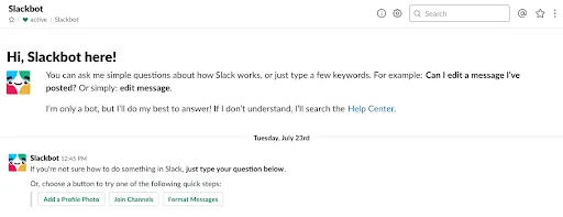
User Onboarding Best Practices #2: Trial Content
If your goal is to create a habit-forming product which users turn to every day (or at least regularly), one popular trend is to allow users to onboard before committing to creating an account. This is particularly common with education apps such as Babbel. When you go to the website, you are given the option of signing up straightaway or jumping right into a free trial mini-lesson.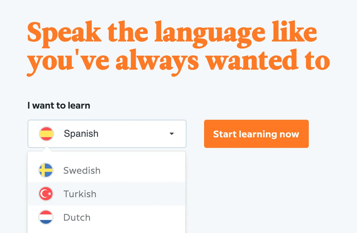 Before Babbel asks the user to commit to setting up an account, the user has already seen all of the languages available, chosen their learning language, completed their first lesson, and made some progress. They’ve also already gained some value from the product, having learned a few key words. This is the moment where they are the most likely to sign up, so this is the moment when Babbel asks them to commit to the sign-up process.
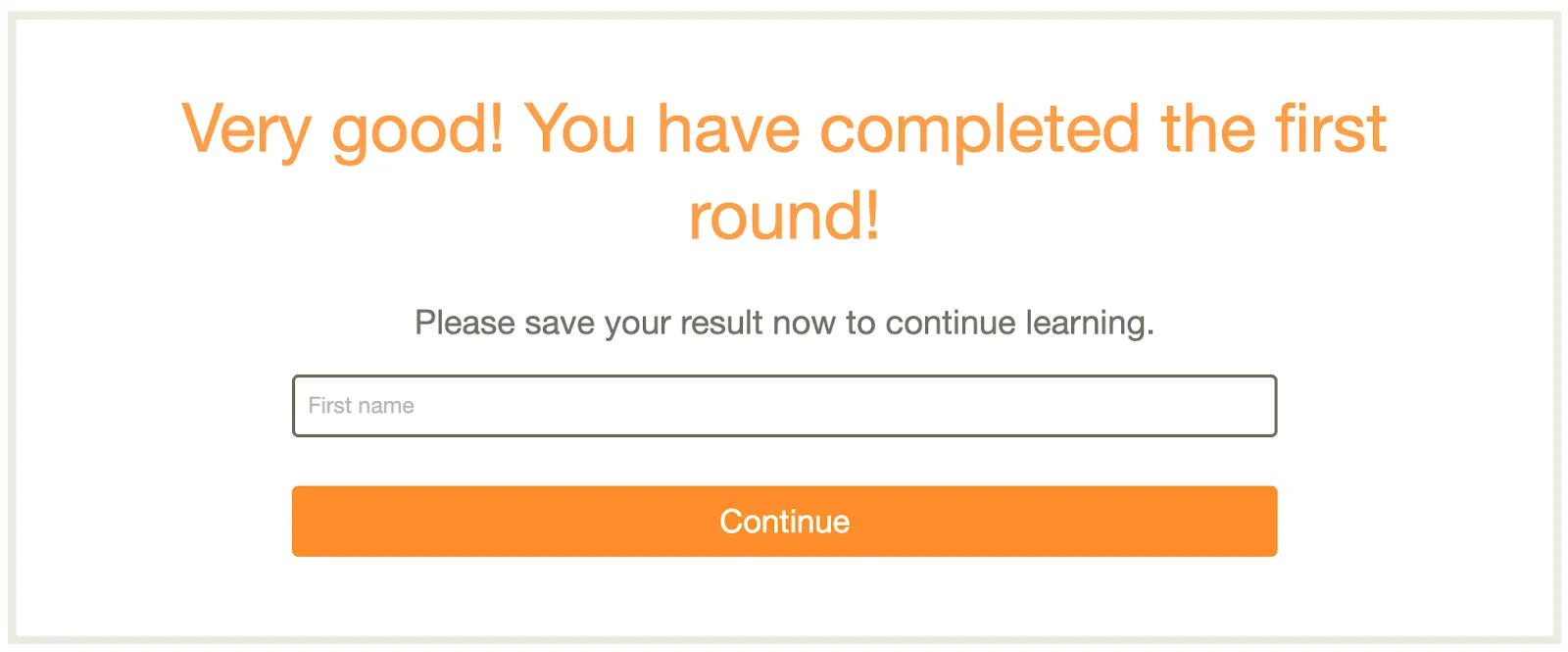
User Onboarding Best Practices #3: Checklists
Some products need a little more thought going into them on the user’s part than others. For example, when people build their first website, most will want to invest plenty of time in the set-up. In that case, it’s probably not a good idea to guide them through a tutorial where they can’t get to the next stage without completing the one they’re on. Perhaps they don’t have a domain name just yet, but they want to get started designing their homepage. Or maybe they have their name picked out, but haven’t decided on a logo yet. WordPress fixes this by adding a checklist in the dashboard that users can come back to and complete whenever they want. Much like the progress bar, this shows the user exactly how far they are in the set-up process while also giving them a detailed list of what they need to work on next. We can’t pretend that this is a brand new feature just for 2019, but it’s still going strong for more dense and time-consuming platforms.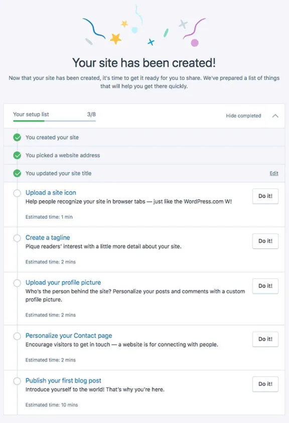
User Onboarding Best Practices #4: Do-It-For-You
Let’s continue looking at website builders. Wix knows that some of their users need even more help to get started. By asking a series of questions, such as whether you’ll need a booking form, the type of business you’re running, and what your preferred color palette is, they’re able to create a basic website based on your choices. At this point, the user is guided through a step-by-step tutorial to personalize the created website rather than build one from scratch.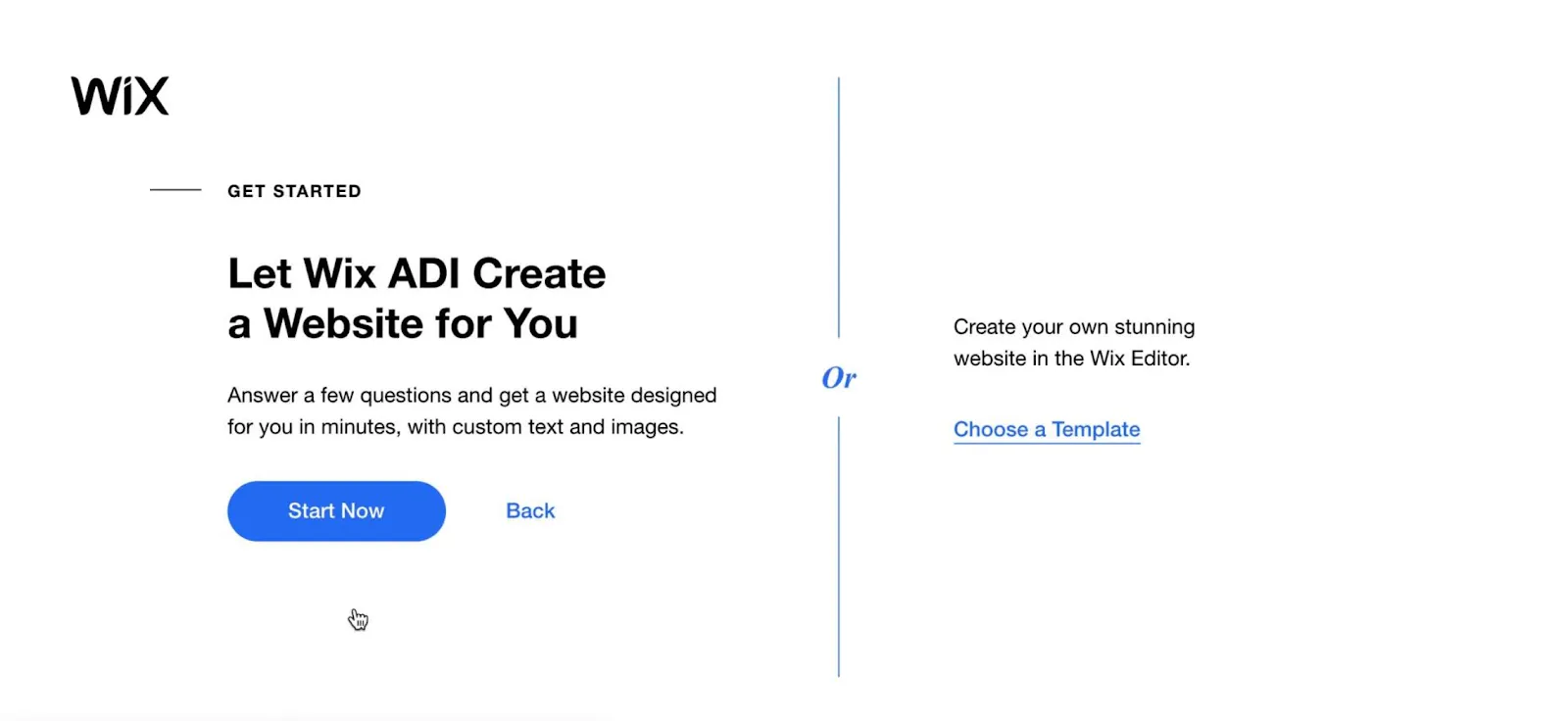
Wix does the work for you, then guides you through personalization.
User Onboarding Best Practices #5: Progress Bars
If your strategy is to let users complete setup at their own pace, a progress tracker works wonders as it both motivates the user to keep going and is also a nice gentle reminder that they still have pending tasks. LinkedIn has been using this feature for a while, and it’s still going strong in 2019. The progress bar guides you through the process of completing your profile, from things like adding any certifications you may have, your education history, and languages you speak. Once a user has completed all of the steps, they’re awarded the status of ‘All-Star.’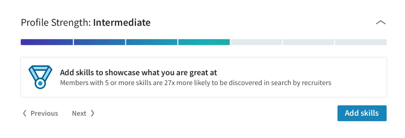
User Onboarding Best Practices #6: Streamlining Content
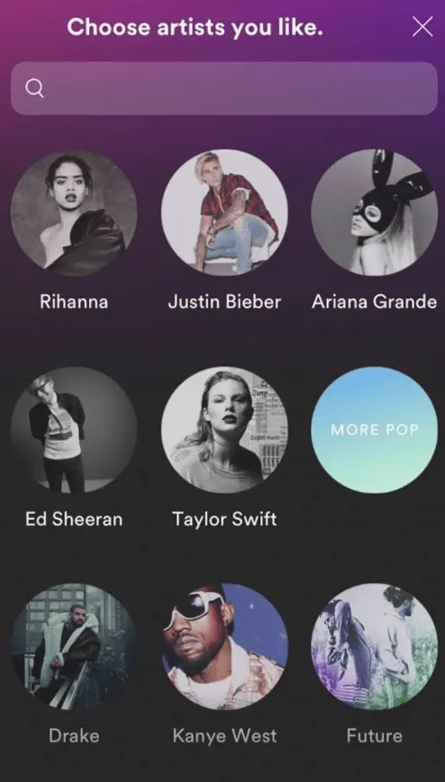
We’ve already seen this method used in a few of the aforementioned strategies, but it’s worth focusing on in more detail. Some of the most engaging user onboarding experiences use personalization at the earliest possible stage to capture the attention of the user, thus immediately making them feel connected to the product. Let’s look at popular design tool, Canva. One of the first things you are shown after signing in is a pop-up asking what you’ll be using Canva for.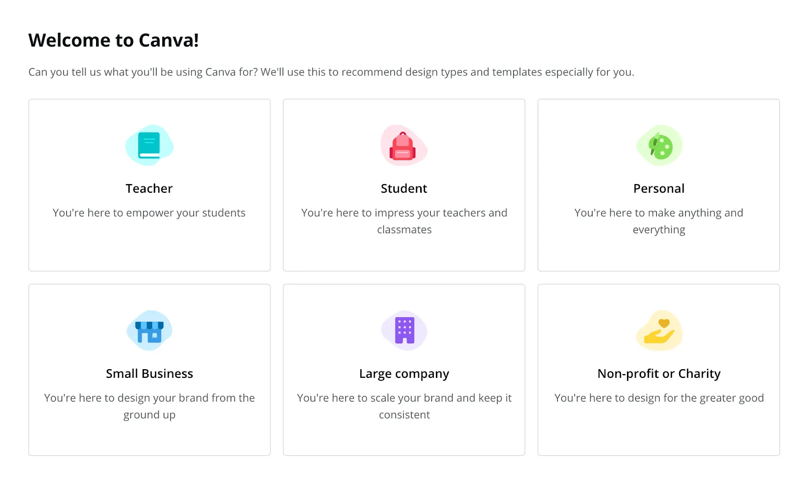 Already the user feels welcomed into the interface and is thinking, “Yes, this product was designed with me in mind.” As Canva has a lot of different content options, which can be a little overwhelming for a first-time user, this personalization helps break down the content into what’s more useful for a particular individual. This level of personalization doesn’t change what content/features are available to the user, but it does streamline the experience in a bid to reduce their time to value.
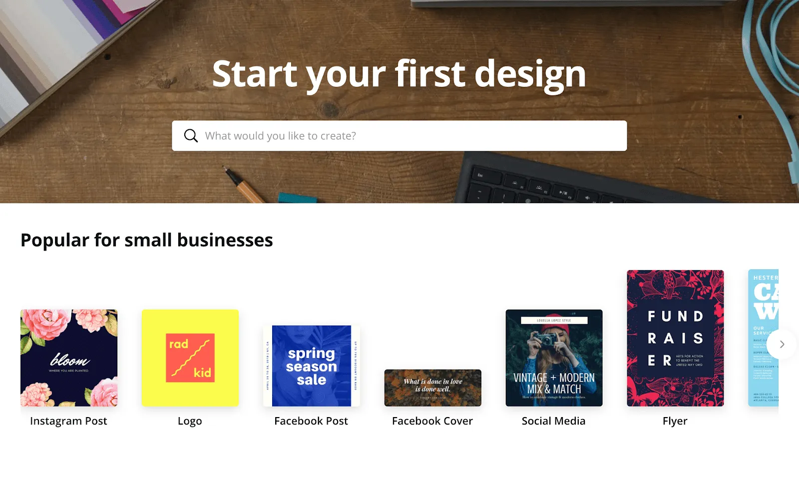
4 Key Takeaways from 6 User Onboarding Best Practices
By now we’ve seen several different ways to create an effective onboarding experience for your user. And there are some general rules that can be applied across the board:- Be strategic, but not sneaky: If you decide to delay sign-up (like Babbel), make sure your user has actually derived some value from your product. Don’t ask them to put in the work and then hit them with a paywall before the reward. Depending on the amount of effort they’ve had to put in, this could actually put them off of continuing. Give them a free taste and let them decide if it’s worth paying for.
- Keep it simple: No one likes swiping through endless screens just to get started. Try to cut the admin down to the bare basics. You can always ask them to complete more steps further down the line.
- Pay attention to your micro-copy: How could you make your CTAs sound more inviting? Have you remembered to present your password rules instead of leaving the user to guess? How wordy is your tutorial? Success is all in the details. Just take a look at this example of password setup from Mailchimp:
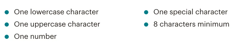
Mailchimp makes it clear what it wants from your password. - Be consistent. Uniformity is your best friend in onboarding. Make any pages, screens, emails, and popups uniform in terms of brand voice and design. Expose your user to the look and feel of your product every step of the way. Going from a bright, bouncy landing page to a standard grey sign-up form takes your user out of the experience you want them to have.